

When a food producer launches a retail brand, the job changes. A packer knows its fruit. A shelf brand has to make a stranger care in a few seconds. For Pacific Coast Fruit Packers, the answer was Wild Coast Fruit Co.: a retail dried fruit brand with a new name, identity, photography style and packaging system rooted in the Pacific Northwest.
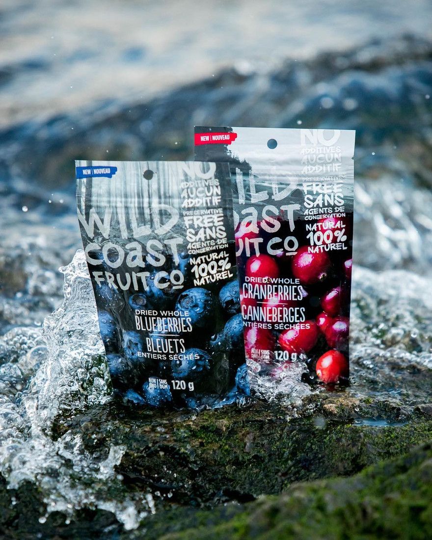
I led the work as lead creative at CREW Marketing Partners.
The brief: premium, Pacific and ready to grow
Pacific Coast Fruit Packers already worked across dried fruit and juice. What it needed was a market-ready retail brand for its dried fruit, built to compete in a crowded category. It had to speak to the natural origins of the fruit and the premium quality customers expected.
It also had to last. The brand needed room to grow the retail range without losing its connection to its Pacific roots. That requirement shaped every decision that followed.
Why start with the name?
A producer's company name rarely works on a shelf. Wild Coast Fruit Co. placed the fruit on the Pacific coast and carried an adventurous spirit that could stretch as the range grew. The name, logo and brand direction were developed together, from the ground up, so the brand read as one idea.
How do you make "Pacific" look like something?
The visual identity balanced a rugged coastline feel with a clean, modern aesthetic that felt fresh and approachable. The result told the story of Canadian-grown produce without leaning on cliché.
The voice landed on "fuel your adventure," written for active, health-conscious consumers.
Photography that did the selling
I art directed all product photography, working with colleagues to source Canadian photographers who could capture the essence of the Pacific coast. The style was bright and authentic, letting the natural colour of the fruit do the work.
That style set the tone for every touchpoint, from pack to web, which is what kept the brand consistent as it grew.
Packaging built for the shelf
The packs combined matte and gloss finishes for a tactile, premium presence. Working closely with our print partners, we used clean, bold typography and vibrant photography to capture the freshness and quality of the fruit in a crowded category.
Extending the story online
The identity carried into digital: web art direction in the same bright tones, a user-friendly site built around the brand story, and user-generated content that invited customers to share their own Wild Coast experiences. A campaign hashtag tied the adventurous spirit together across platforms.
What did it deliver?
- A cohesive identity connecting the product to its Pacific Canadian origins
- One photographic style across packaging, web and retail
- Packaging with a premium, tactile finish that stands out on shelf
- A digital presence that invited community through user-generated content
- A visual language flexible enough to carry new products as the retail range grows
Aaron delivered a brand that didn't just sell our products, but told a story. A story of wild coastlines, fresh flavours, and the adventurous spirit that fuelled them all.
- Pacific Coast Fruit Packers
The principle
A producer becomes a shelf brand when it sells origin as clearly as it sells product. Told well, origin is the premium.
Quick answers
How does a food producer create a retail brand?
Start with a name that can live on a shelf, build the identity around origin, and set a photography and packaging system flexible enough to grow the range.
What makes dried fruit packaging stand out?
Bright, authentic fruit photography, clean bold typography, and tactile finishes such as matte and gloss combined.
Who created the Wild Coast Fruit Co. brand?
Aaron Armstrong of Serif + Gold, as lead creative at CREW Marketing Partners, for Pacific Coast Fruit Packers.
Agency: CREW Marketing Partners