

Here's the paradox I see constantly: creative agencies that do brilliant work for their clients walk into pitches with mediocre brands of their own.
They've got portfolios full of sharp, purposeful design. Work that speaks to positioning. Work where every detail matters and nothing is accidental. And then they show you their own logo - designed in-house on a Friday afternoon, or outsourced to a junior, or worse, just inherited from some rebranding five years ago that nobody finished.
The disconnect is stunning. And the irony? Your own brand is the only first impression you get to design.
Why Agency Branding Is Different
When you brand a CPG company, you're designing for a consumer who has maybe five seconds on a shelf. When you brand a professional services firm, you're designing for decision-makers who will spend time with your work.
But when you brand an agency, you're doing something else entirely: you're proving what you claim to be, before you ever have the chance to prove it with work.
A pitch for a design agency isn't just about the portfolio. Your brand is the first piece of work they evaluate. It answers the question before they ask it: "Do these people practice what they preach?"
If your agency's positioning is "we move fast and think creatively" but your brand is stiff and safe, they've already decided you don't. If you claim to bridge legacy and innovation but your visual identity shows no connection between past and future, they know you're talking about something you don't actually believe in.
The best agency brands don't just look good. They prove the agency's positioning through design itself.
The Framework: Positioning Made Visible
This is the framework I use when branding an agency:
- Step 1 What is the agency's real positioning? Not the tagline. Not the elevator pitch. The actual, specific thing that makes them different. The problem they solve better than anyone else. The way they think.
- Step 2 What visual or conceptual language proves that positioning? This is where most agencies get stuck. They think "we need a modern logo." No. You need design elements that prove your claim.
- Step 3 Let those elements do the heavy lifting. The logo, the colour palette, the typography, the icon system, the spatial design - every choice should whisper (or shout) what the agency actually does.
Veto Agency: Movement as Proof
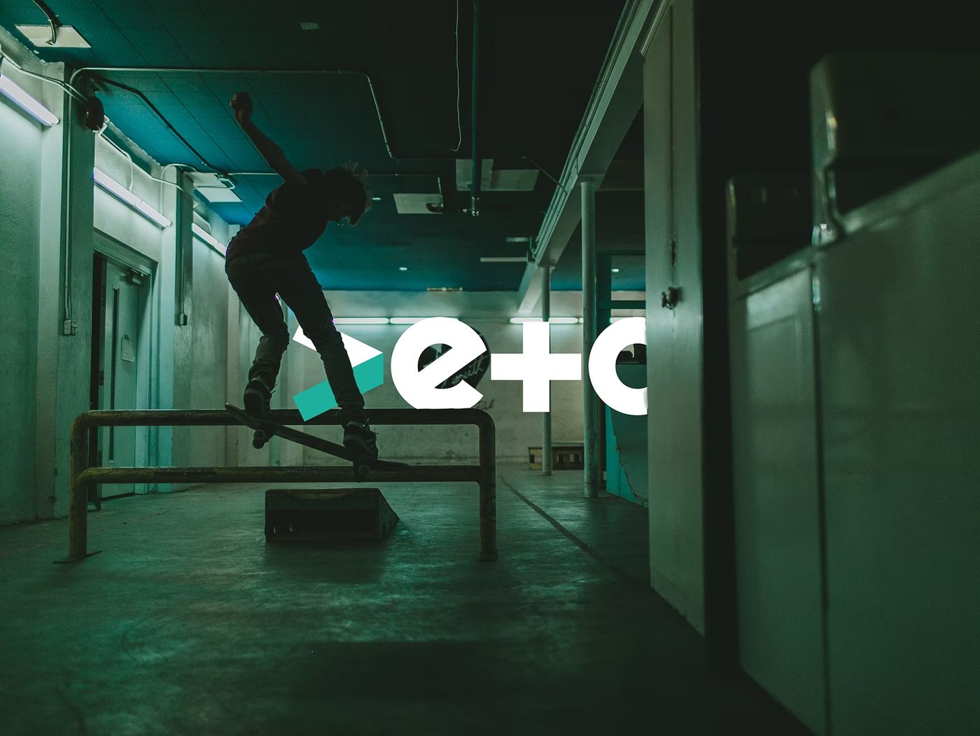
Veto wanted to be known for being different, for moving fast, for creative thinking that isn't static. Their brand needed to feel active, not resting.
The brand language became movement itself. Dynamic forms. Lines that suggest motion. A visual identity that feels like it's in the middle of a gesture, not at the end of one. When you see Veto's work, you don't just understand that they're creative - you feel the movement.
They didn't add movement to look trendy. Movement is their positioning. The design proves it.
Blue Meta: Bridging the Gap
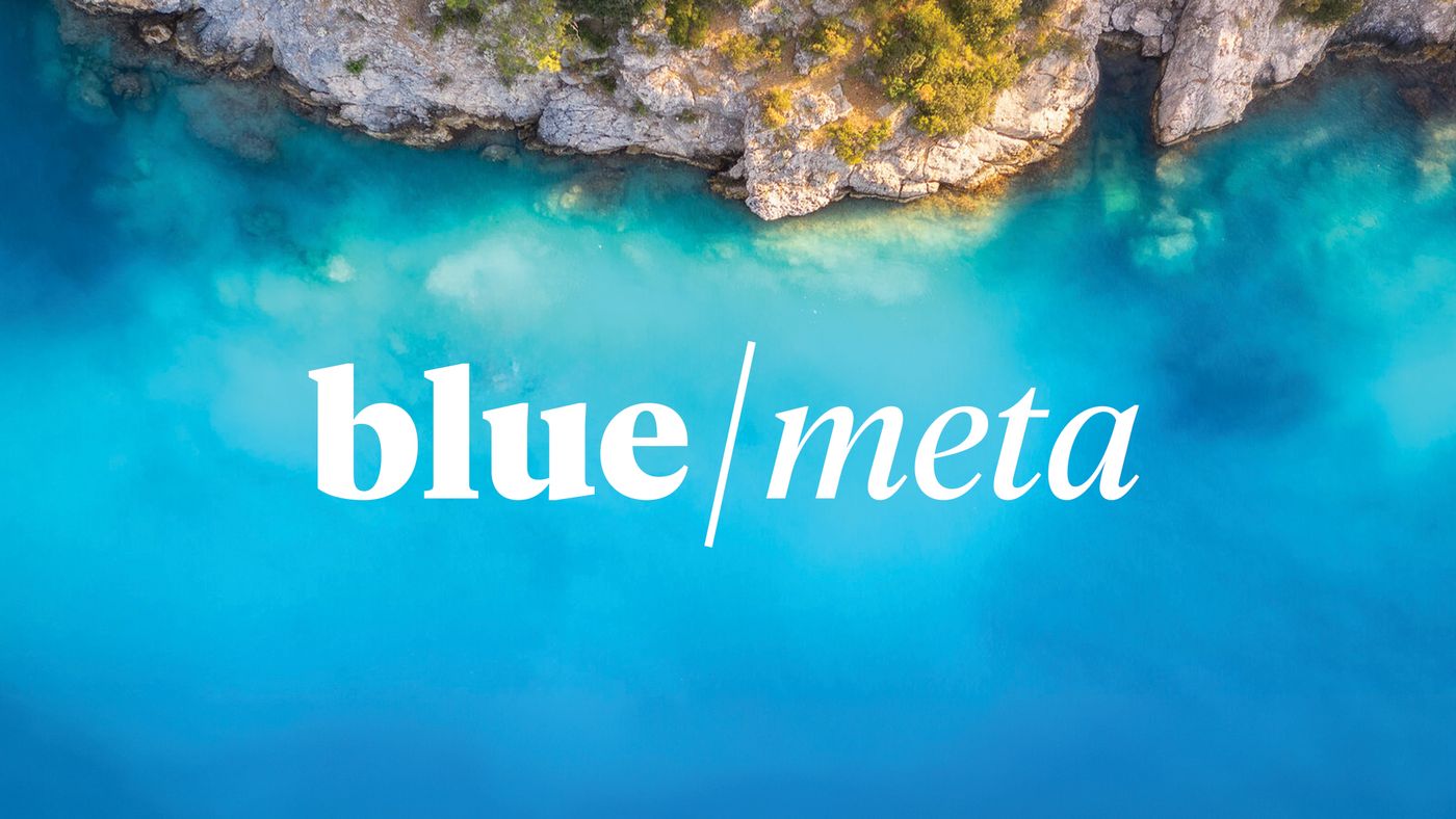
Blue Meta sits in an interesting space: they work with established brands who are navigating digital transformation. Their positioning is about bridging - taking heritage and connecting it to contemporary technology. Old and new, side by side.
Their brand needed to show that bridge visually. The colour palette does it. The form language does it. Where legacy might suggest one direction, their design pulls it toward digital. Where new might suggest another, they anchor it back to substance.
Every element of their brand shows the conversation between old and new. That's not decoration - that's evidence.
Picnic Creates: Malleability as Strength
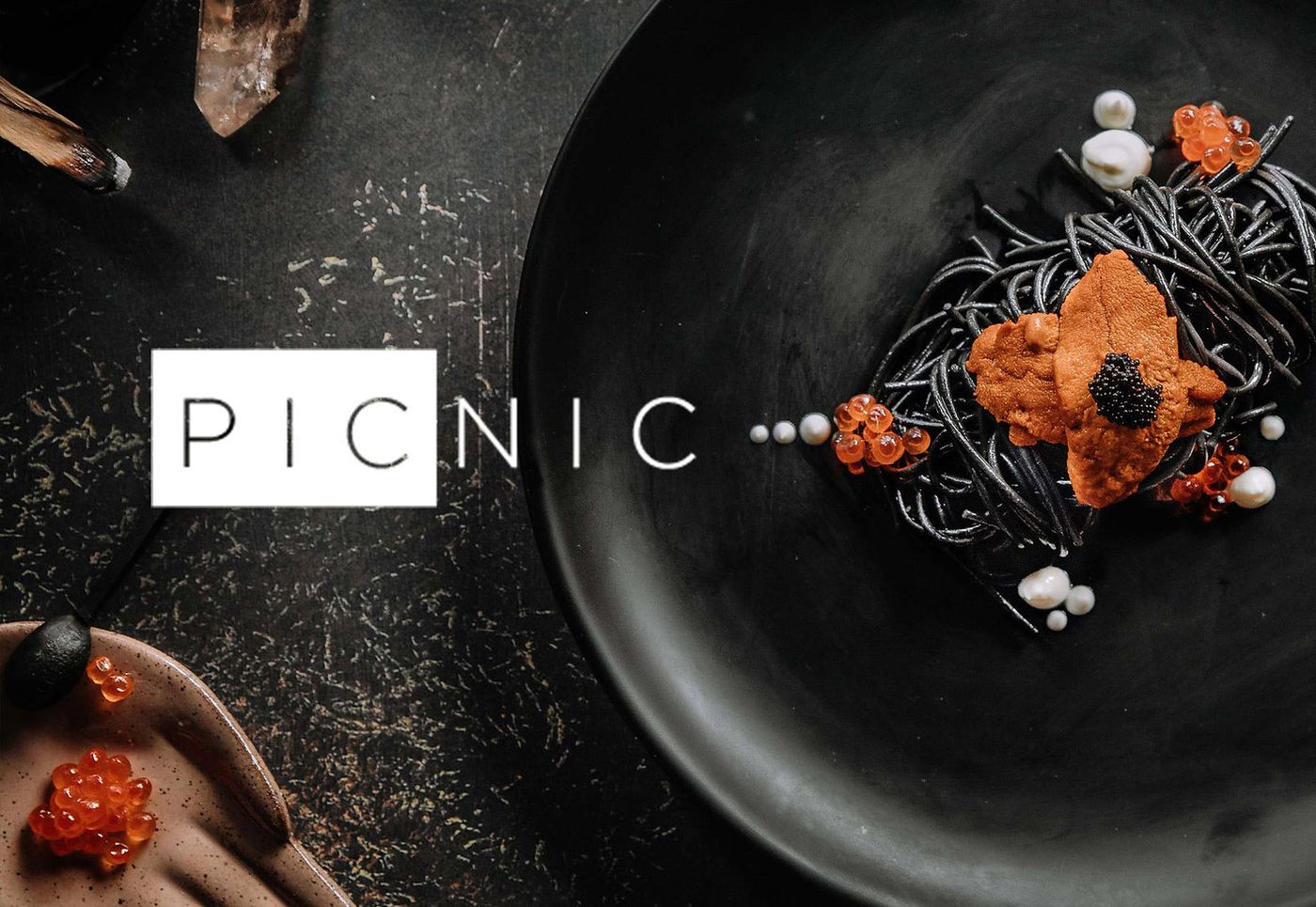
Picnic is a content production agency for food and beverage brands. Their positioning isn't "we do beautiful photography and video." It's "we're the flexible partner who adapts to what you need." A window. A screen. A view into your brand.
That malleability lives in their brand details. The 16:9 ratio showing up deliberately in their mark. The shapes that feel like frames, like windows, like screens. Small details that most people wouldn't consciously notice, but that prove they understand the world of aspect ratios and framing.
The brand itself is malleable. It adapts. It shape-shifts. Just like they do.
Agency Acquisitions: Growth as Icon
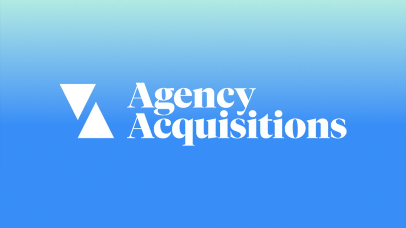
Agency Acquisitions isn't just an agency - it's a platform where agencies sell or are acquired. Their brand needed to communicate growth, trajectory, rise. Not in a cheesy way. In a real, financial way.
Their icon does it. Simple shapes that suggest both rise and fall, growth and decline, the actual mechanics of what their business does.
The mark isn't arbitrary. It's the story of their business, simplified into form.
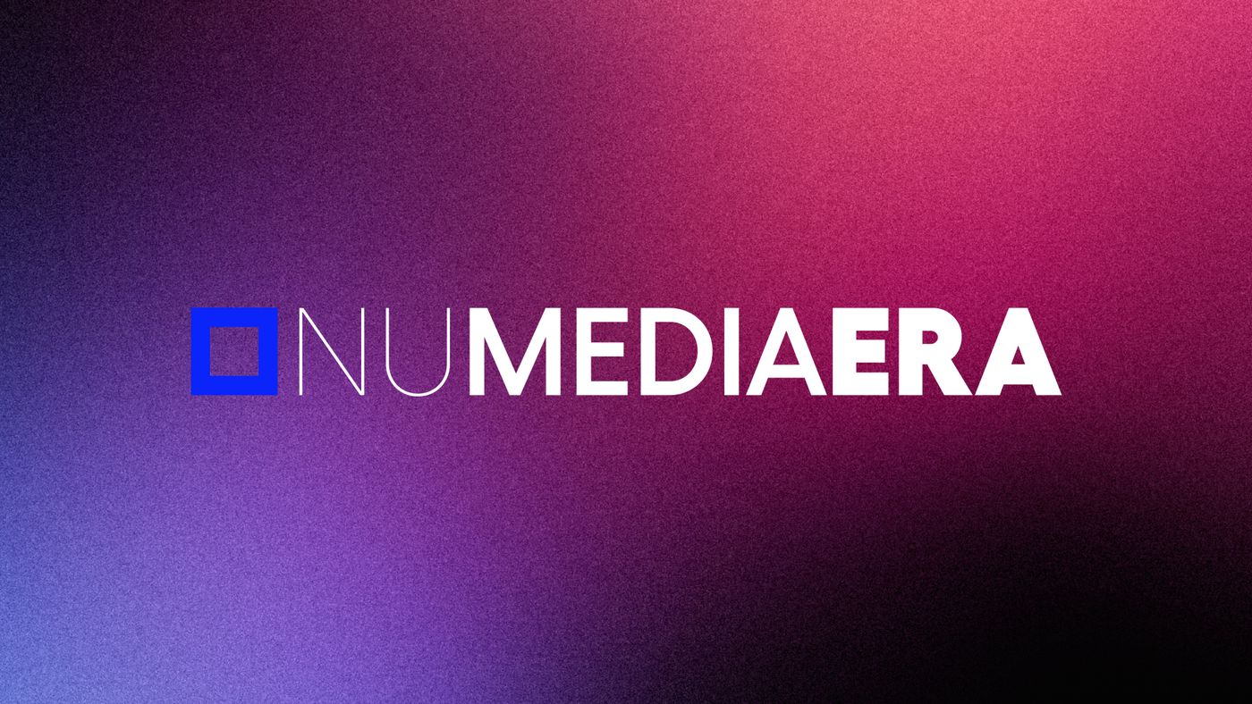
Nu Media Era: Expertise Made Visible
Nu Media Era is a digital agency. Their positioning: contemporary, digital-native, sophisticated. But they also needed to communicate stability and expertise - this is a professional firm, not a startup.
Their brand balances those tensions. The contemporary sans-serif says "we're current." The pixel symbol says "we're digital-native." The colour palette - dark blues paired with vibrant orange - says "we're strong and warm and expert."
The brand didn't add random elements. Each one solves a positioning problem.
What This Means for Your First Impression
When a prospect walks into your pitch, they're evaluating you before you open your mouth. Your brand is the first piece of evidence. It's the answer to "Do these people actually understand what they're talking about?"
The agencies that get this right aren't the ones with the slickest logos. They're the ones where every detail proves their positioning. Where the brand isn't separate from the work - it is the work.
Most agencies miss this. They focus on portfolio. They focus on the pitch. They focus on relationships. And they leave their own brand as an afterthought.
The agencies that win the work they actually want understand that your brand isn't a side project. It's your first and most important proposal.
Because before you get to show them what you can do, you have to show them that you actually believe in what you're showing them. Your own brand is where you prove that.