

Creating a strong brand identity is more than just picking a pretty logo or a catchy tagline. It’s about weaving together every visual and verbal element into a seamless story that resonates with your audience. When done right, your brand identity guidelines become the blueprint that keeps your messaging consistent and your visuals unmistakable. Today, I want to walk you through the essentials of crafting cohesive logos and brand identity guidelines that truly reflect your business’s soul.
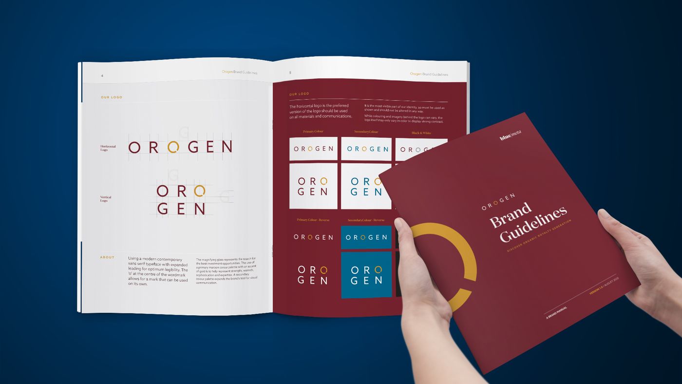
Most brand guideline documents are written to be admired. They open with a moodboard, spend four pages on the story behind the mark, show the logo on a tote bag, and end with a colour palette nobody can find when they need the CMYK build.
That document is not a guideline. It is a portfolio piece with a title page.
A real guideline has a narrower job: make good brand decisions repeatable when the person who made the original ones is not in the room. Your packaging printer at 4pm on a Friday. A junior marketer building a deck. The agency you hired last month. None of them were in the strategy session. All of them are about to make a decision that either compounds your brand or quietly erodes it.
The guideline exists for them, not for you.
If your guideline cannot resolve an argument, it is decoration.
Why cohesion is the actual deliverable
A logo is a single asset. Cohesion is the thing you are really buying.
Cohesion is what makes a customer recognize you on a shelf they were not looking at, in a feed they were scrolling past, on a truck they saw for two seconds. It is built from repetition - the same colour, the same typographic rhythm, the same photographic register, showing up consistently enough that recognition happens below conscious thought.
Every inconsistency spends a little of that. One off-brand deck does not matter. Forty of them do. And the erosion is invisible until the day you look at your own touchpoints side by side and realize they do not look like they came from the same company.
That is what the guideline is preventing. Not ugliness. Drift.
The logo comes out of strategy, not out of a sketchbook
Before there is a mark, there has to be a position. Every logo decision that holds up is downstream of a strategic one that was made first.
Here is the sequence that actually works:
1. Establish the position before you draw anything. Not the mission statement. The specific, defensible thing that makes this business different from the one three doors down. If you cannot state it in a sentence, the mark will not be able to either.
2. Map the category so you know what to avoid. Pull up twenty competitors side by side. In most categories you will see three or four visual conventions repeated endlessly - real estate has its turquoise and its tiny house icons, professional services has its abstract swoosh. Knowing the conventions tells you where the open ground is.
3. Sketch wide before you refine. This phase is about volume and range, not polish. The first idea is almost never the one, and the fifth is often a better version of the first.
4. Test it small, in one colour, on a bad screen. A mark that only works at 400px on a white artboard is not finished. Most of the places your logo will actually live are small, monochrome, or compressed.
5. Build the variants before you sign off. Primary lockup, stacked, horizontal, icon-only, reversed, single colour. If these get made later as an afterthought, they will not hold together.
The mark is not decoration on top of the strategy. It is the strategy, compressed into a form small enough to fit on a bottle cap.
What actually belongs in a brand guideline
Strip out the pages that exist to look impressive and you are left with these. Each one earns its place by preventing a specific, predictable failure.
Logo system and clear space. Every approved lockup, with minimum sizes and the exclusion zone drawn. This prevents the single most common failure: someone crowding the mark because the space was tight.
Misuse examples. Show the stretching, the recolouring, the drop shadow, the mark on a busy photo. People understand rules faster when they see them broken. This page prevents more damage than any other.
Colour with full build data. HEX, RGB, CMYK, Pantone, and the vinyl or substrate reference if you produce physical goods. A colour palette without a CMYK build is not a specification, it is a mood. Include the tolerance you will accept, because print will not match your screen and everyone needs to know in advance how much variance is acceptable.
Typography as a hierarchy, not a list. Not "our fonts are X and Y." Instead: what sets a headline, what sets body copy, what sets a caption, what the fallback is when the licensed font is not available. Include the web-safe substitute, because someone will eventually need one.
Photographic and illustrative direction. Show approved images beside rejected ones and explain the difference in a sentence. "Natural light, real environments, no stock gestures" is a usable rule. "Authentic and aspirational" is not.
Voice, with examples. Three adjectives are useless. Instead give paired examples - a sentence written on-brand next to the same sentence written off-brand. That comparison teaches voice in ten seconds where a list of adjectives teaches nothing.
Applied templates. The deck, the letterhead, the social frames, the label die-line. Most brand drift happens because someone needed an asset urgently and there was no correct version available, so they made one.
The two failure modes
Guidelines fail in exactly two directions, and they fail for opposite reasons.
Too loose and it settles nothing. Vague direction, no specifications, no examples. Everyone reads it, everyone interprets it differently, and within a year you have five versions of your brand in the wild. The document was written to inspire when it needed to decide.
Too rigid and it gets ignored. Every scenario legislated, no room for judgment, so the first time someone hits a case the document did not anticipate, they abandon it entirely. And they never come back to it.
The version that works locks the things that carry recognition - the mark, the colour, the typographic system - and leaves deliberate room in the things that need to flex by context. Then it says which is which, out loud, so nobody has to guess.
Specify what carries recognition. Give room to everything else.
Keep it alive or it dies in a folder
A guideline written once and filed is a guideline nobody follows. Three things keep it working:
Make it findable. If it lives in a folder three levels deep that only two people can access, it does not exist. It should be one link, shareable to an external partner in under ten seconds.
Walk people through it once. Fifteen minutes of context beats fifty pages of documentation. People follow rules they understand the reason for.
Revisit it annually. Not a rebrand. A read-through. Note what got broken, what got asked repeatedly, what scenario came up that the document did not cover. Then patch it. A guideline that has never been updated is one nobody has been using.
What this is really buying you
A cohesive identity is compounding infrastructure. Every consistent touchpoint makes the next one work slightly harder, because recognition builds on repetition and repetition only happens when the rules hold.
The businesses that get this treat the guideline as an operating document, not a design deliverable. It sits with the brand the way a spec sheet sits with a product - unglamorous, constantly referenced, and the reason the thing holds together at scale.
Get the mark right. Then write the document that protects it.