

A limited-edition can should stretch a brand, not escape it. The best special releases keep the signals people already love, then push craft, finish and story further than the core range can. That was the brief behind Flannel Pyjamas Grand Cru, the Camp Beer Co. release that took Bronze in the Single Packaging category at the 2024 Canada Beer Cup.
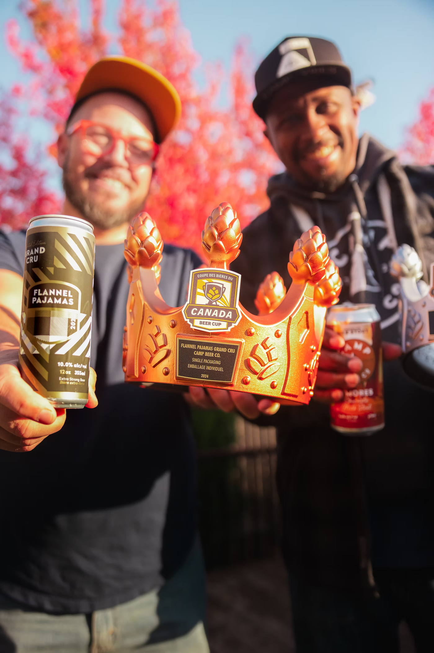
The beer people were protective of
Every brand has one product the regulars feel they own. At Camp Beer Co., that was Flannel Pyjamas. People had a relationship with it long before the anniversary came round and we decided to release it as a limited-edition Grand Cru.
That carried a specific tension. Push the craft further than anything we had produced. Make it feel like an occasion. And do not make it feel like a different brand.
Why do most limited editions go wrong?
Most special releases treat the occasion as permission to abandon the identity. New palette, new type, new mood. What comes back is a beautiful can nobody recognizes, sitting on the shelf with no memory attached to it.
The fix is deciding early what cannot change. For Flannel Pyjamas Grand Cru, two things stayed fixed: Camp's signature typography and the flannel pattern from the original identity. Everything else was allowed to level up.
How did the packaging earn "premium"?
The label runs intricate laser-cut patterns across a matte-coated metallic stock. The shimmer of the can reads through the cuts rather than being printed on top, so the effect shifts as the can turns in your hand. Ink cannot fake that.
Camp's typography held the clarity and continuity. An elegant script sat against it for contrast, enough to signal an occasion without becoming a different voice. The flannel-inspired pattern tied straight back to the original can, the thread that kept the whole thing recognizable.
The palette stayed tight: gold, black, white and metallics. In a category where limited editions reach for more colour, more foil and more everything, restraint did the real work. Discipline is what read as premium.
Where did the QR code fit?
We embedded a QR code on the label that opened exclusive behind-the-scenes video from the brewing team.
It was not a novelty. Camp had built its brand on the people behind the beer, and a Grand Cru is the moment a drinker is most curious about how it was made. The code turned a thirty-second shelf interaction into a five-minute one, and put the brewers, the real reason the beer is good, in front of the person holding the can.
What did the industry say?
Canada Beer Cup judging assessed typography, layout, creativity, colour and shelf presence. The design earned Bronze in the Single Packaging category. Feedback from designers and creative directors landed on the same themes.
Use of metallic, colour restraint, A+. Love the flat pattern. Simplistic without being sparse.
- Heather Cranston, Creative Director, Pulp + Paper
Beautifully designed and unique. Great use of metallics and shape structure. Fonts nicely complement. Well done.
- Lise Hansen, Designer + Illustrator
Beautiful, clean design.
- Jaime Cushnie, Director, Creative Services, The Show and Tell Agency
The principle
The slim-line can, the finish work and the video layer did what a limited edition should. They gave the regulars something worth keeping and gave everyone else a reason to look twice.
A limited edition is not a chance to escape your brand. It is a chance to prove how far it can stretch without breaking.
Quick answers
How do you design a limited-edition can that still looks like your brand?
Fix two or three core brand signals, such as typography or a signature pattern, and let finish, materials and story carry the upgrade.
What makes limited-edition packaging feel premium?
Tactile finishes and restraint. A tight palette and one standout production technique usually read as more premium than adding colour and foil.
What award did Flannel Pyjamas Grand Cru win?
Bronze in the Single Packaging category at the 2024 Canada Beer Cup.
Agency: In-house at Camp Beer Co.