
Mariner Brewing
Label System + Illustration
Mariner Brewing is a craft brewery rooted in the idea of exploration, creating beers that invite people to discover new flavours and experiences. The project focused on reworking the packaging system to better reflect this core idea and give the brand a stronger presence both on shelf and within its growing product lineup.
Prior to the redesign, the brand concept of navigation existed in name but lacked depth in execution. The identity did not yet carry a clear narrative or visual system that could evolve alongside new beer releases.
The introduction of a new illustrated logo featuring a floating astronaut created a starting point for a more imaginative direction. Building from this, the packaging system became an opportunity to extend the concept into a fully realized storytelling framework.


The Challenge
The existing Mariner brand had a strong conceptual foundation but limited expression. Without a clear narrative system, each beer release felt disconnected, making it difficult for the brand to build recognition across its growing range.
The challenge was to create a packaging framework that could support a wide range of beers while building a cohesive brand world that felt distinctive, memorable, and scalable.
Craft beer is an increasingly competitive space, where packaging plays a critical role in capturing attention and communicating personality. Mariner needed a system that could both unify its products and differentiate each release.

Strategic Insight
At the core of the Mariner brand is the idea of exploration. Originally tied to navigation and discovery, this concept provided a strong foundation for expanding the identity into something more imaginative and expressive.
Each beer could then become a new destination. Naming conventions, flavour profiles, and visual design all work together to create the sense that every product is part of an ongoing journey.
The introduction of the astronaut character shifted the brand from traditional navigation into a broader concept of exploration across unknown worlds. This allowed the brand to move beyond literal references and into a more creative storytelling space.


Creative Direction
The creative direction focused on building a narrative driven packaging system centred around the Mariner astronaut. Rather than treating the character as a simple logo, it became the main protagonist within a series of illustrated scenes that evolve across each release.
This approach allows the brand to balance consistency and creativity. The astronaut provides continuity across the range, while the illustrated environments give each beer its own story and sense of discovery.
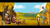
Each can features a unique world tied to the flavour of the beer, from distant planets to imagined environments inspired by ingredients and names. These scenes are highly detailed and expressive, giving each product its own identity while maintaining a consistent visual language.


The Packaging System
A flexible label system was developed to support a growing number of SKUs while maintaining a cohesive brand presence. Each label follows a consistent structure that anchors the brand while allowing the illustration to take centre stage.
Over the course of two years, this system was expanded across nearly twenty SKUs, allowing the brand to grow while maintaining a clear and recognizable identity.
Colour, composition, and naming work together to differentiate each beer. Product names draw inspiration from space, star systems, and planetary themes, reinforcing the overarching concept of exploration.

Execution
The Mariner packaging system was built through ongoing collaboration and iteration, evolving with each new beer release. Each label required a new illustrated scene, tied closely to both the name and flavour profile of the product.
Examples such as beers named after star systems or concepts like Planet POG demonstrate how the system allows for both creativity and cohesion across the range.
The work involved developing naming conventions, visual storytelling, and packaging layouts that could scale while maintaining consistency. The astronaut character remained central, acting as the thread that connects each product within the larger brand world.


Impact
The redesigned packaging system brought a new level of identity and storytelling to Mariner Brewing. The brand evolved from a concept rooted in name alone into a fully realized visual world that could grow with each new release.
The project demonstrates how expanding a core idea through illustration and storytelling can transform a brand from a single concept into an evolving and engaging experience.
By creating a narrative framework, the packaging allowed each beer to feel part of a larger journey while still standing on its own. This helped build stronger recognition across the product lineup.


Creative Leadership
As the sole creative on the project, I was responsible for rethinking the packaging system and developing the storytelling direction that now defines the Mariner brand.
The Mariner project reflects how a strong concept, when fully explored, can move beyond a name and become a living system that grows with every product.
My role involved building the narrative framework, guiding the illustration direction, and ensuring each new release contributed to a cohesive and expanding brand world.